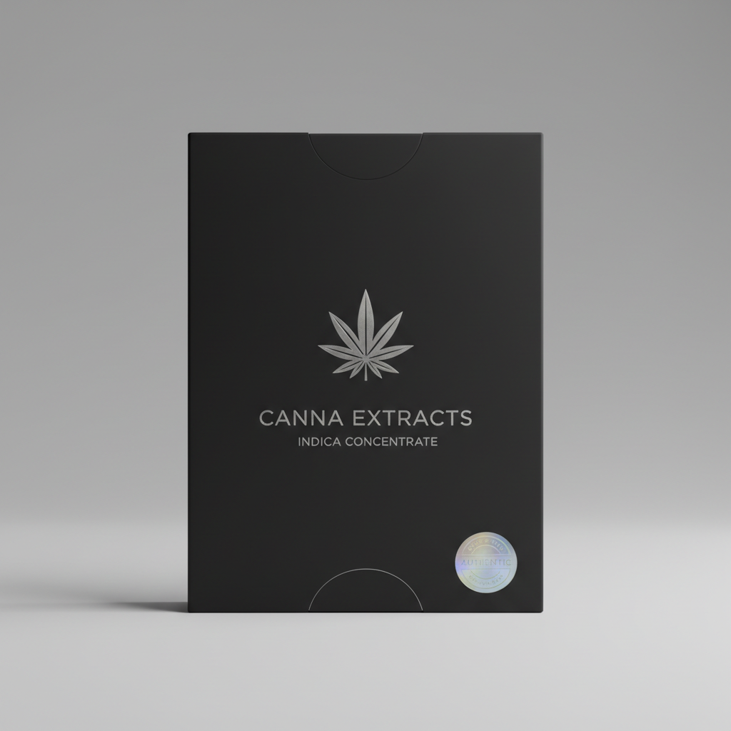
Solstice
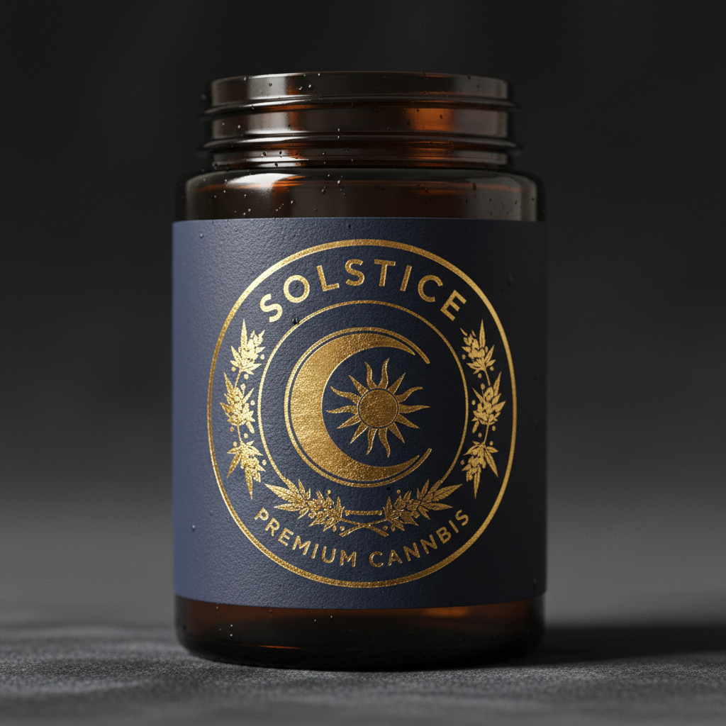
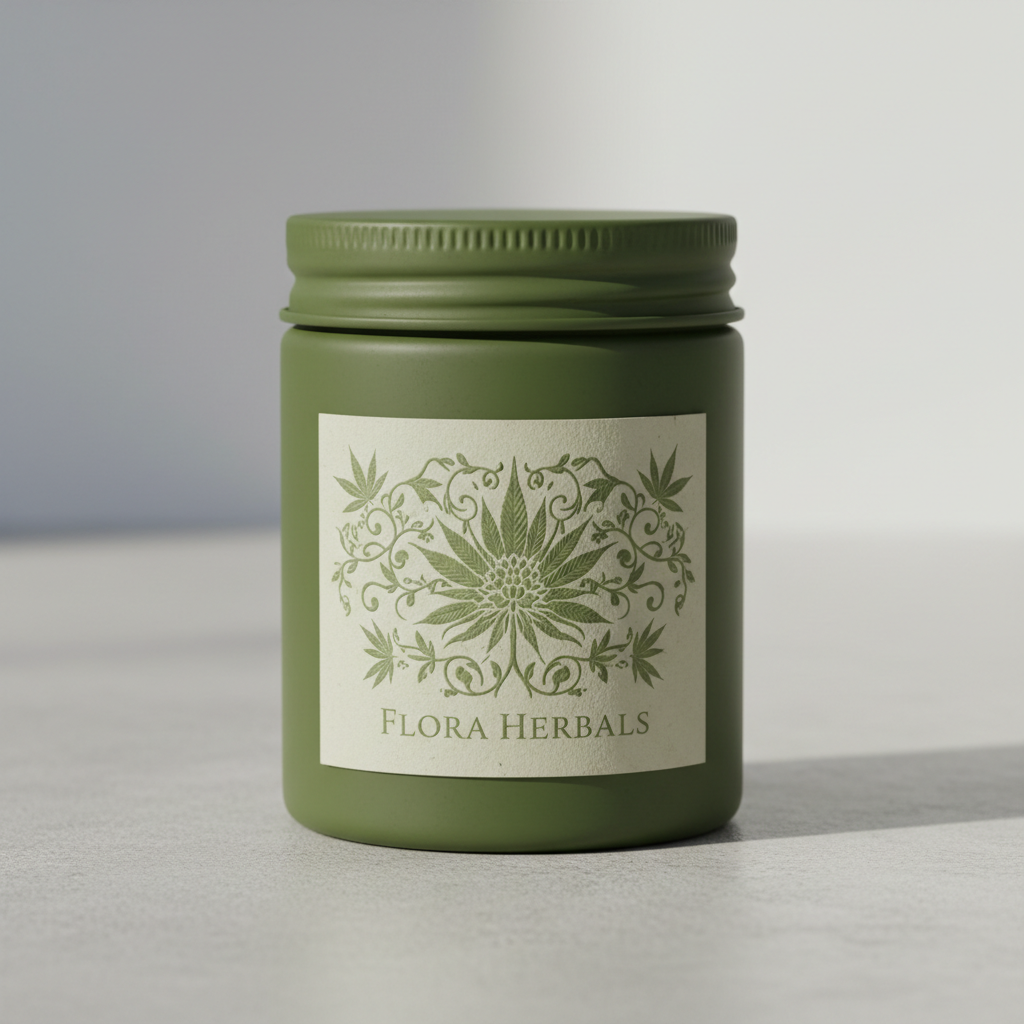
"One label. Twelve awards."


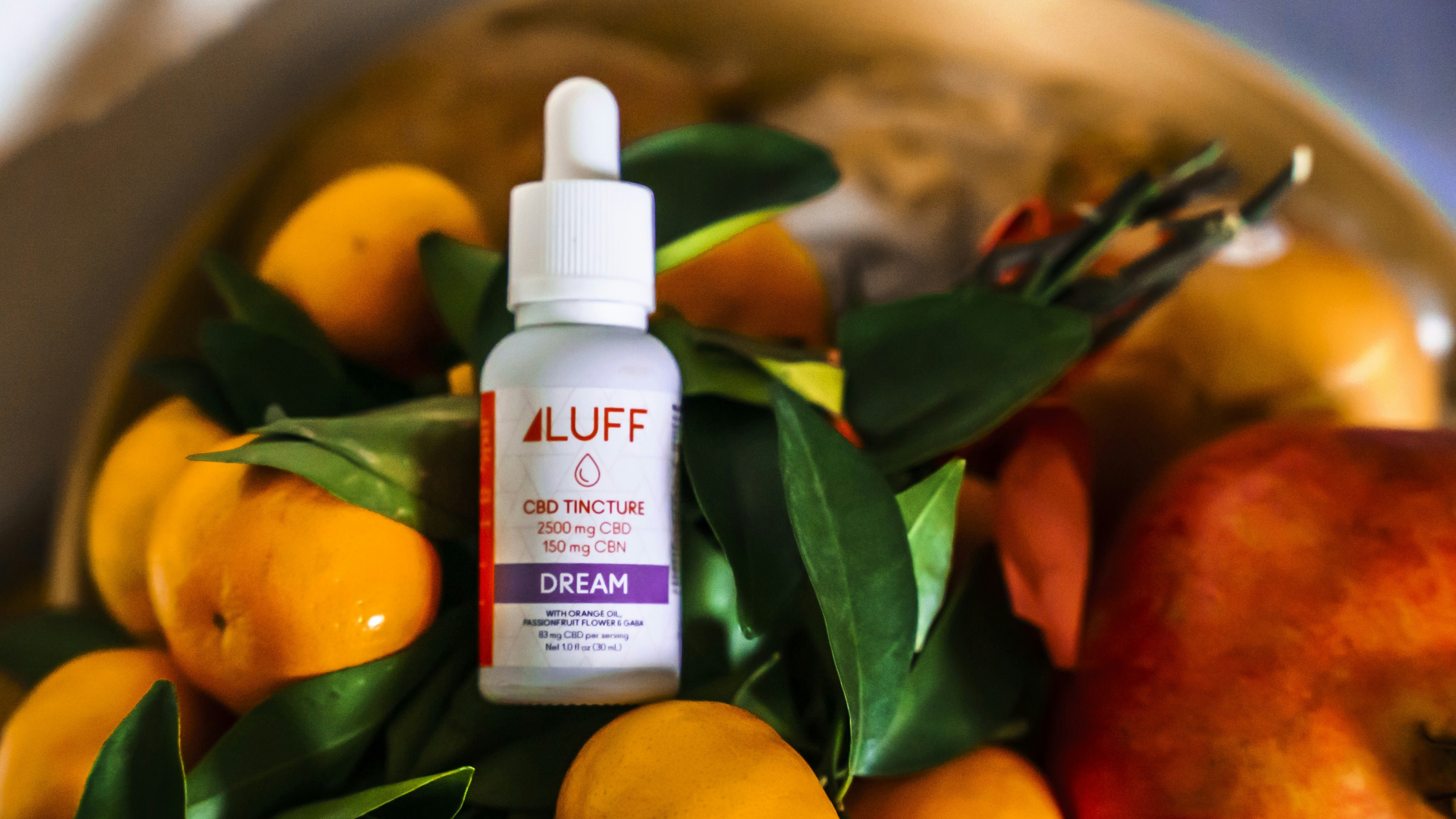
A craft Colorado grower entering the legal market needed a label that communicated terroir-level quality. We designed a single 1oz flower jar label that became the most photographed product at MJBizCon 2025.
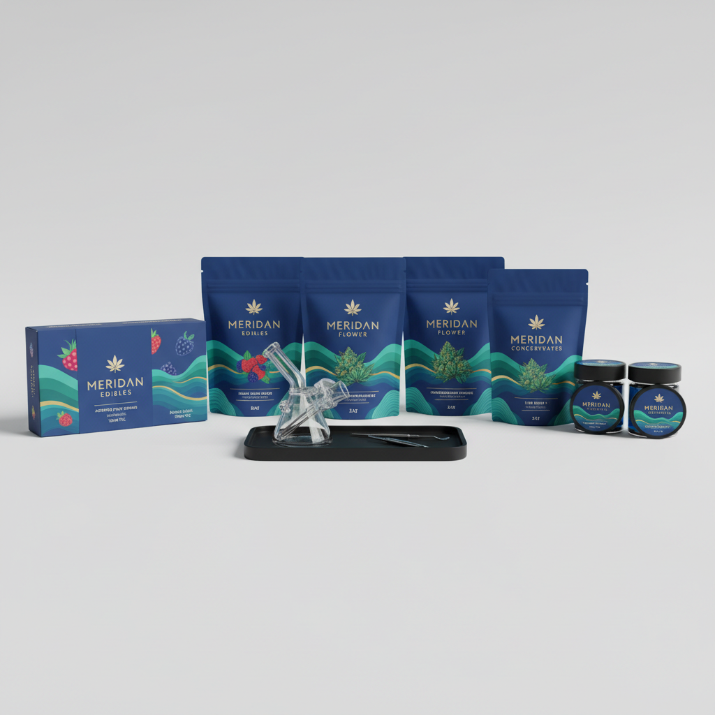
"One label. Twelve awards."


A craft Colorado grower entering the legal market needed a label that communicated terroir-level quality. We designed a single 1oz flower jar label that became the most photographed product at MJBizCon 2025.
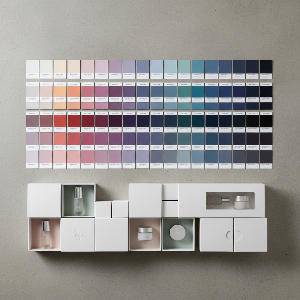
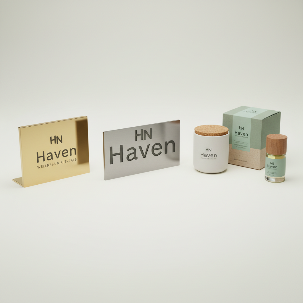
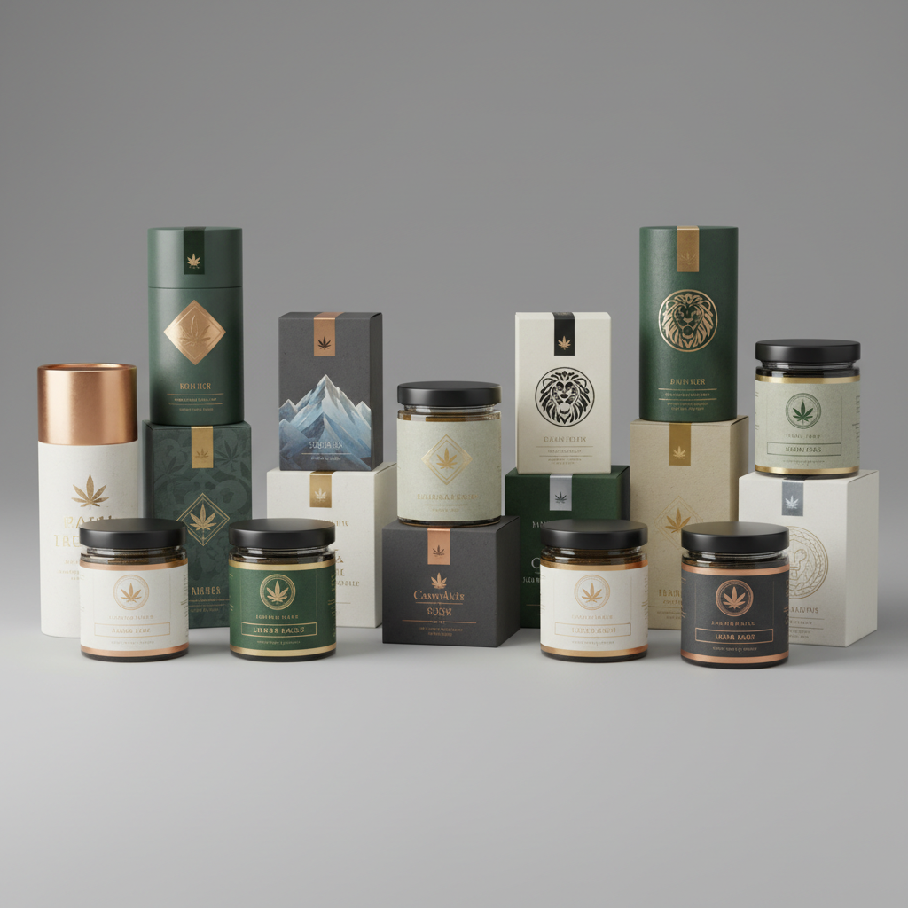
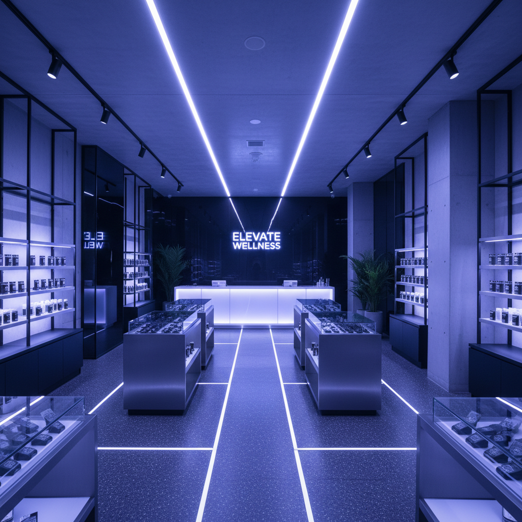
"A wellness brand that happens to sell cannabis."


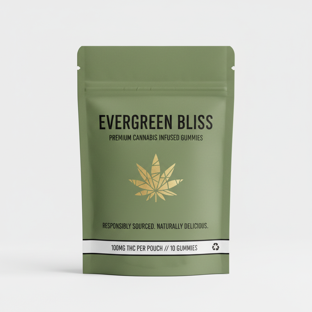
A Nevada MSO launching 22 SKUs across three categories needed a system that could scale without losing coherence. We built a modular identity with color-coded product families and a typography hierarchy that works from 4pt compliance text to 6-foot dispensary signage.
No commitment · 15-minute intake
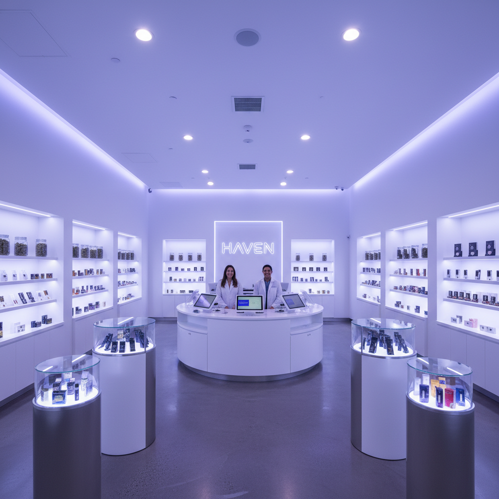
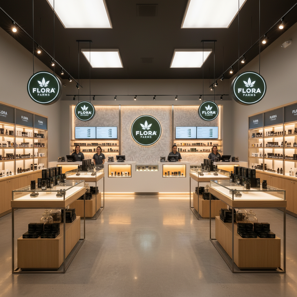
"The dispensary that made the wellness crowd forget it was a dispensary."


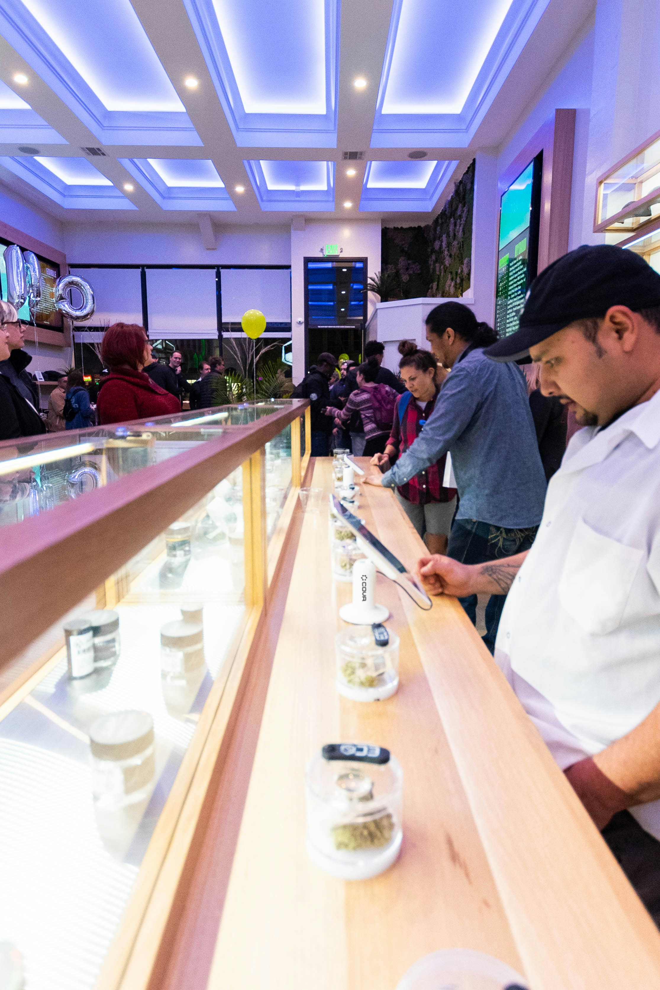
A Pacific Northwest chain of 9 locations needed to shed the head-shop aesthetic and court the yoga-and-CBD crowd. We designed every touchpoint — logo, signage system, interior environment, staff uniforms, paper bags, and the digital menu experience.
We design every touchpoint that stands between your product and a customer's wallet.

Labels, boxes, mylar bags, and jar systems engineered for shelf impact and compliance. Every format, every state.
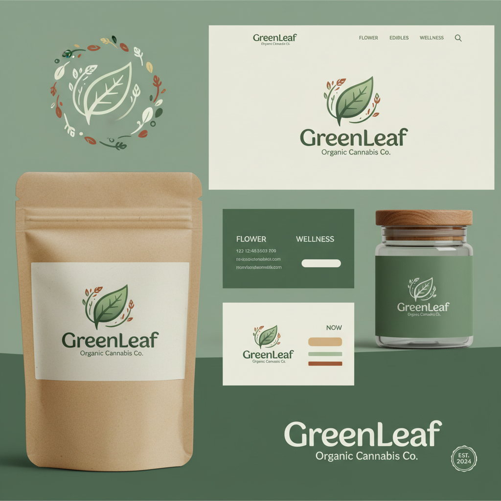
Logo systems, color architecture, and typography that scale from a 4pt compliance disclaimer to a 40-foot billboard.
Complete dispensary buildouts — signage, fixtures, display systems, and the atmospheric design that makes product covetable.

Positioning, naming, and consumer research that places your brand in the right lane before a single label is printed.

38 pages on how to shed the stoner stereotype, court the wellness crowd, and build a dispensary brand that commands a price premium. Used by 6 chains currently operating in regulated markets.
No spam · Instant PDF download · Unsubscribe anytime